SOLUTIONS
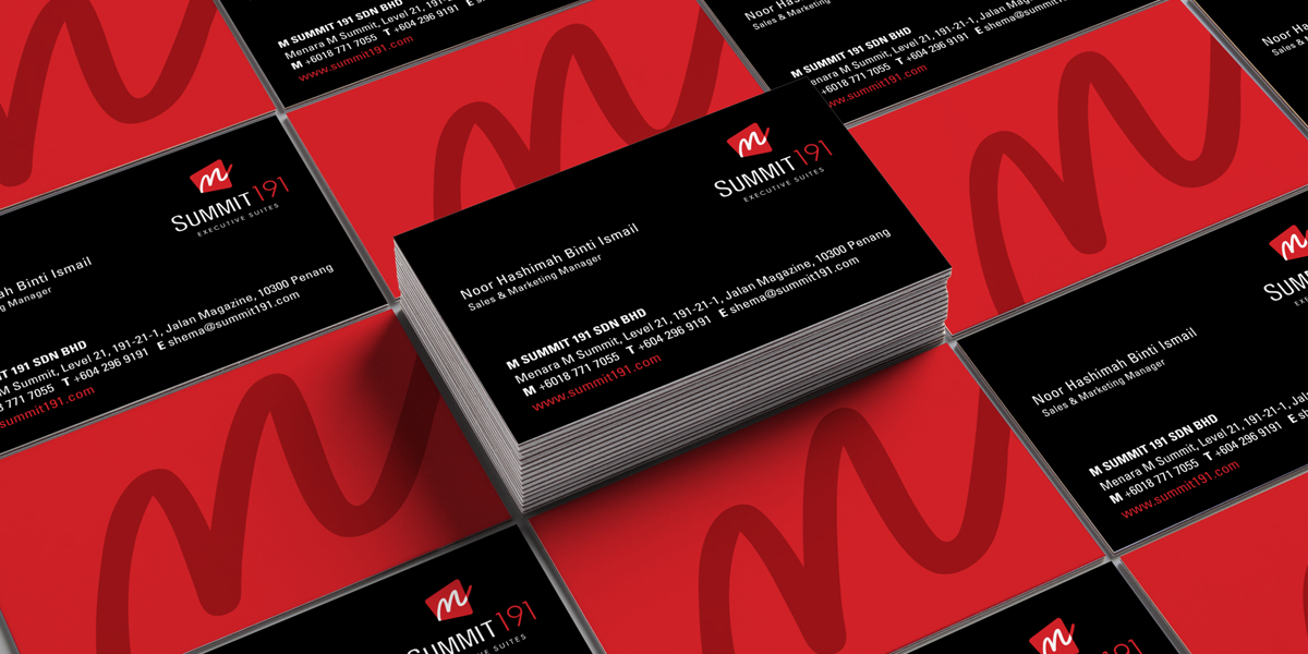
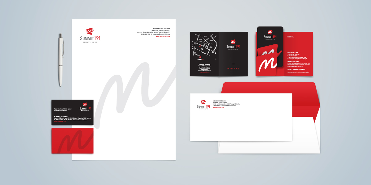
Create a captivating and modern brand that stands out.
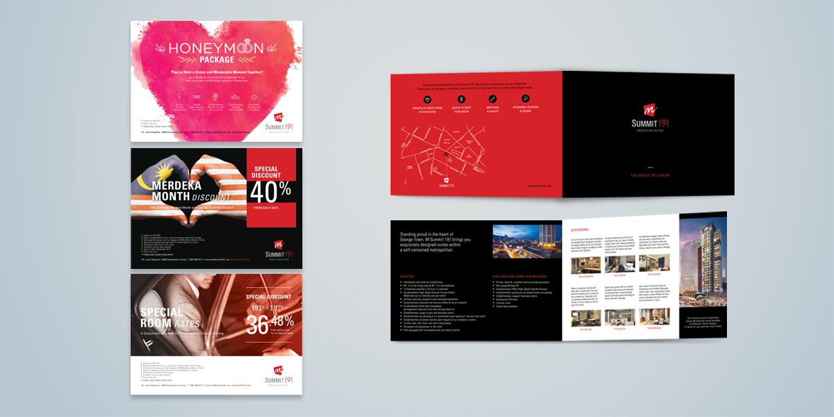
We proposed that the brochure is covered with a mysterious black cover with striking red lines that looked like levels of light, representing the Tower Parking System. That idea wow-ed with the M Summit team and they redesigned the facade to look like the brochure. Marketing materials, such as hoardings, signboards, press ads, the marketing brochure, pull up banners, and invitation cards were also created for M Summit's sales team to market the project.


